Social Network Analysis in R
Social Network Analysis in R, Social Network Analysis (SNA) is the process of exploring the social structure by using graph theory.
It is mainly used for measuring and analyzing the structural properties of the network.
It helps to measure social network relationships (Facebook, Twitter likes comments following etc..), Email connectivity, flows between groups, organizations, and other connected entities.
In this training tutorial, we will be using a small network that indicates a connection between the two columns’ information.
Look at the example data provided below in that the first and second columns are connected with social networks.
Please make commonly used words in social network analysis.
A network is represented as a graph, which shows links (if any) between each vertex (or node) and its neighbors.
Edge: – A-line indicating a link between vertices.
Component: – A group of vertices that are mutually reachable by following edges on the graph.
Path: -The edges followed from one vertex to another are called a path.
Tidyverse in R complete tutorial
Load Library
library(igraph)
Getting Data
data <- read.csv("D:/RStudio/SocialNetworkAnalysis/socialnetworkdata.csv", header=T)The same dataset you can avail from gitHub click here
y <- data.frame(data$first, data$second)
Create network
net <- graph.data.frame(y, directed=T)
V(net)
+ 52/52 vertices, named, from 4c03f50:
 [1] AA AB AF DD CD BA CB CC BC ED AE CA EB BF BB AC DC BD DB CF DF BE EA CE EE EF FF FD GB GC GD AD KA KF LC DA EC FA FB DE FC FE GA GE KB KC KD KE LB LA LD LE
E(net)
290/290 edges from 4c03f50 (vertex names):
  [1] AA->DD AB->DD AF->BA DD->DA CD->EC DD->CE CD->FA CD->CC BA->AF CB->CA CC->CA CD->CA BC->CA DD->DA ED->AD AE->AC AB->BA CD->EC CA->CC

 [20] EB->CC BF->CE BB->CD AC->AE CC->FB DC->BB BD->CF DB->DA DD->DA DB->DD BC->AF CF->DE DF->BF CB->CA BE->CA EA->CA CB->CA CB->CA CC->CA

 [39] CD->CA BC->CA BF->CA CE->CA AC->AD BD->BE AE->DF CB->DF AC->DF AA->DD AA->DD AA->DD CD-
....................................................................................
....................................................................................
[153] CA->CC CD->CC CA->CC BB->CC DF->CE CA->CE AE->GA DC->ED BB->ED CD->ED BF->ED DF->ED CC->KB AD->EA EF->EA CF->KC EE->BB CC->BB BC->BB

[172] CD->KD AE->CF DF->AC DF->AC ED->AC KA->CA BB->CA CB->CA CC->CA EB->CA BE->CC BE->CD CB->CD CB->KE ED->AB AB->KF BA->AF CC->AF CA->AF
+ ... omitted several edges
We got 52 vertices and 290 edges. Let’s assign the labels.
V(net)$label <- V(net)$name
V(net)$degree <- degree(net)
Histogram of node degree
hist(V(net)$degree,
     col = 'green',
     main = 'Histogram of Node Degree',
     ylab = 'Frequency',
     xlab = 'Degree of Vertices')

Around 35 nodes with less than 10 degree and some nodes with high degree (60 to 70 connections) also.
It indicates that many nodes with few connections and few nodes with many connections.
Network diagram
set.seed(222)
plot(net,
     vertex.color = 'green',
     vertext.size = 2,
     edge.arrow.size = 0.1,
     vertex.label.cex = 0.8)

Highlighting degrees & layouts
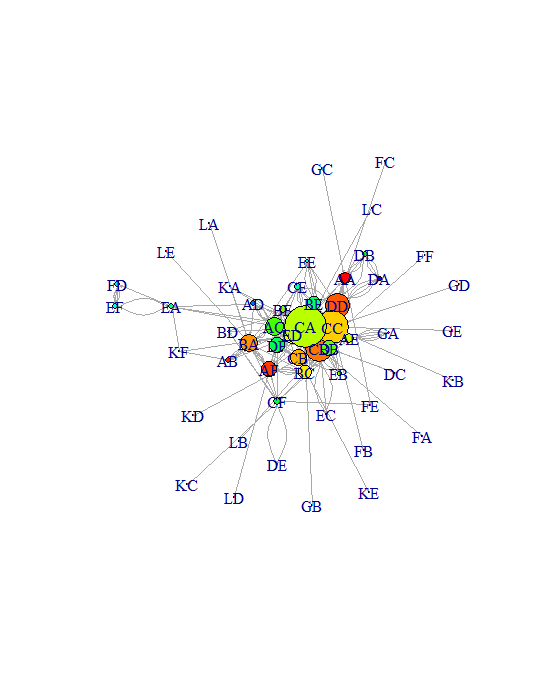
plot(net,
     vertex.color = rainbow(52),
     vertex.size = V(net)$degree*0.4,
     edge.arrow.size = 0.1,
     layout=layout.fruchterman.reingold)

CA has the highest degree followed by others.
plot(net,
     vertex.color = rainbow(52),
     vertex.size = V(net)$degree*0.4,
     edge.arrow.size = 0.1,
     layout=layout.graphopt)
plot(net,
     vertex.color = rainbow(52),
     vertex.size = V(net)$degree*0.4,
     edge.arrow.size = 0.1,
     layout=layout.kamada.kawai)

You can try out with different layouts and you can use for best one suited to your requirements.
Hub and Authorities
Basically, the hub has many outgoing links, and Authorities have many incoming links.
hs <- hub_score(net)$vector
as <- authority.score(net)$vector
set.seed(123)
plot(net,
     vertex.size=hs*30,
     main = 'Hubs',
     vertex.color = rainbow(52),
     edge.arrow.size=0.1,
     layout = layout.kamada.kawai)

You can see the highest outgoing links from CC and CA.
set.seed(123)
plot(net,
     vertex.size=as*30,
     main = 'Authorities',
     vertex.color = rainbow(52),
     edge.arrow.size=0.1,
     layout = layout.kamada.kawai)

It is the exactly the same layout with maximum incoming from CA followed by CC.
Community Detection
To detect densely connected nodes
net <- graph.data.frame(y, directed = F)
cnet <- cluster_edge_betweenness(net)
plot(cnet,
     net,
     vertex.size = 10,
     vertex.label.cex = 0.8)

Now you can see within the groups there are dense connections and between the groups with sparse connections.