QQ-plots in R: Quantile-Quantile Plots-Quick Start Guide
QQ-plots in R, first need to understand the Q-Q plot. The Q-Q plot is a graphical tool to help us examine if a set of data plausibly came from some theoretical distribution such as a Normal or not.
Suppose, if we are executing a statistical analysis the test comes under parametric methods assumes variable is Normally distributed, we can make use of a Q-Q plot to check that assumption.
It’s just a visual verification, not full proof, so we can make use of some other statistical test also. But Q-Qplot allows us to see at-a-glance if our assumption is valid or not.
Basically, a Q-Q plot is a scatterplot created with the aid of using plotting units of quantiles towards one another.
If each unit of quantiles got here from the identical distribution, we have to see the factors forming a line that’s more or less straight.
Discriminant Analysis in r » Discriminant analysis in r »
Here we are going to discuss an example of a Normal Q-Q plot when both sets of quantiles come from Normal distributions.
QQ-plots in R
We are making use of mtcars package in R.
head(mtcars)
                    mpg cyl disp  hp drat    wt  qsec vs am gear carb
 Mazda RX4         21.0   6  160 110 3.90 2.620 16.46  0  1    4    4
 Mazda RX4 Wag     21.0   6  160 110 3.90 2.875 17.02  0  1    4    4
 Datsun 710        22.8   4  108  93 3.85 2.320 18.61  1  1    4    1
 Hornet 4 Drive    21.4   6  258 110 3.08 3.215 19.44  1  0    3    1
 Hornet Sportabout 18.7   8  360 175 3.15 3.440 17.02  0  0    3    2
 Valiant           18.1   6  225 105 2.76 3.460 20.22  1  0    3    1
Make a plot for the variable mpg, qqnorm function produces a normal QQ plot of the variable
qqnorm(mtcars$mpg, pch = 1, frame = FALSE)
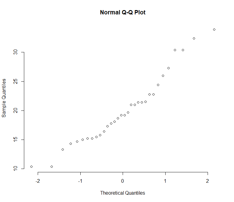
Add a line to the plot, qqline function adds a reference line
Intraday Stock Trading in R » Strategy & Chart Reading »
qqline(mtcars$mpg, col = "steelblue", lwd = 2)
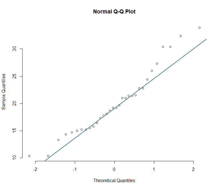
More or less points are closer to the straight line.
qqPlot function also avilable from car package, Let’s see how to plot the same.
library(car)
qqPlot(mtcars$mpg)
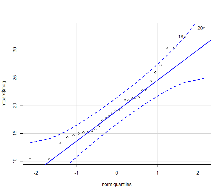
qqPlot function provides better visualization compared to previous one. Almost all points fall approximately along this straight line, so we can assume normality.
Normality Test in R » How to Perform » Easy Steps »
Let’s see how to plot the same in ggplot.
library(ggplot2)
ggplot(mtcars, aes(sample=mpg))+stat_qq()+theme_bw()
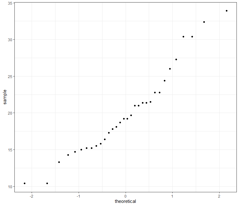
We can make use of qplot function also,
qplot(sample = mpg, data = mtcars)+theme_bw()
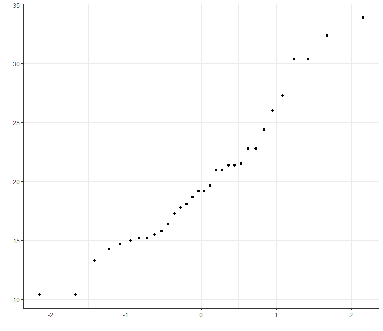
We can change qq plot point shapes by groups
Decision Trees in R » Classification & Regression »
Create Q-Q plot based on groups
p<-qplot(sample = mpg, data = mtcars, color=cyl)+theme_bw()
p
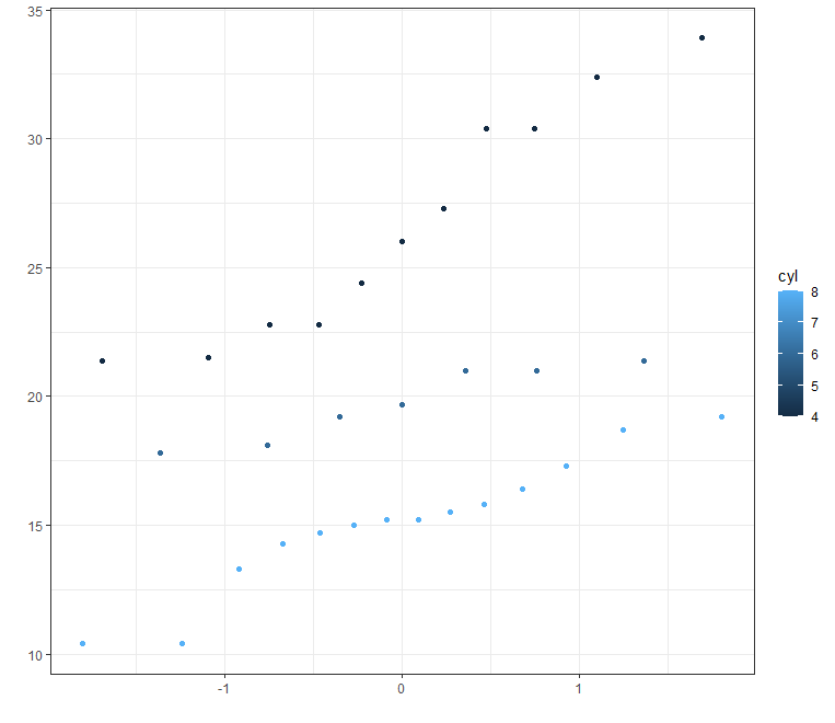
You can legend position to different places.
KNN Algorithm Machine Learning » Classification & Regression »
p + theme(legend.position="top")
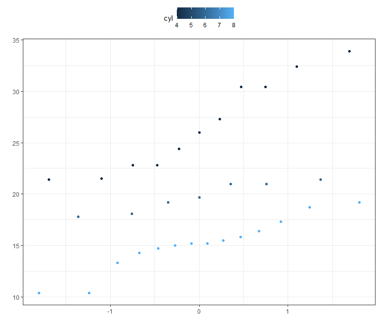
p + theme(legend.position="bottom") # legend at bottom
p + theme(legend.position="left") #legend at left
p + theme(legend.position="none") # Remove legend
The result you got from Q-Q plot you can verify the same based on shapiro test.
shapiro.test(mtcars$mpg)
Shapiro-Wilk normality test
data: mtcars$mpg
W = 0.94756, p-value = 0.1229
The result is not significant, so we can assume the normality.
Don’t forget to show your love, Subscribe the Newsletter and COMMENT below!
[newsletter_form type="minimal"]


Hello There. I found your blog using msn. This
is a really well written article. I will be sure to bookmark it and
come back to read more of your useful information. Thanks
for the post. I will definitely return.