Line types in R: Ultimate Guide For R Baseplot and ggplot
There are six pre-described line types available in base R. You can use those for any type of graphics, like plotting for line charts or developing simple shapes.
In R base plot functions, two options are available lty and lwd, lty stands for line types, and lwd for line width. The type of line you can be specified based on a number or a string. In R the default line type is “solid”.
In the case of ggplot2 package, the parameters linetype and size are used to decide the type and the size of lines, respectively.
In this tutorial describes how to change line types in R for plots created using either the R base plot or from the ggplot2 package.
Visualization Graphs-ggside with ggplot »
You will understand how to:
- Use the different types line graphs in R.
- Plot two lines and modify the line style for base plots and ggplot
- Adjust the R line thickness by specifying the options lwd and size.
- Change manually the appearance of linetype, color and size
Different line types in R
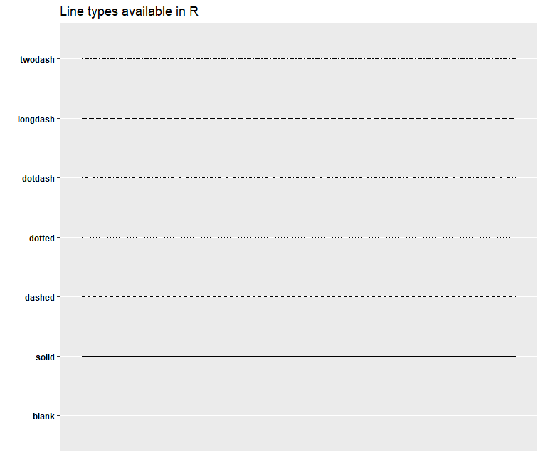
From ggpubr package with single line of code we can show the list of line types available in R.
library(ggpubr)
show_line_types()
We cam make use below function and write clear labels with number and string.
LineTypes<-function(){
  oldPar<-par()  par(font=2, mar=c(0,0,0,0))
  plot(1, pch="", ylim=c(0,6), xlim=c(0,0.7),  axes=FALSE,xlab="", ylab="")
  for(i in 0:6) lines(c(0.3,0.7), c(i,i), lty=i, lwd=3)
  text(rep(0.1,6), 0:6, labels=c("0.'blank'", "1.'solid'", "2.'dashed'", "3.'dotted'",
                                 "4.'dotdash'", "5.'longdash'", "6.'twodash'"))
  par(mar=oldPar$mar,font=oldPar$font )}
LineTypes()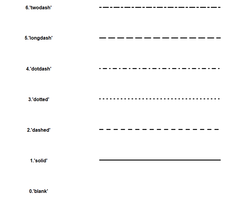
Change R base plot line types
R lines functions:-
plot(x, y, type = "l", lty = 1). Create the main plot
lines(x, y, type = "l", lty = 1). Add lines onto the plot.
Key options:
- x, y: variables to be used for the x and y axes.
- type: display the data as line and/or point. Lowed values: l (display line only), p (show point only), and b (show both).
- pch and cex: setpoints shape and size, respectively.
- lty, lwd: set line types and thickness.
- col: change the color of point and line.
- xlab and ylab: for x and y-axis labels, respectively.
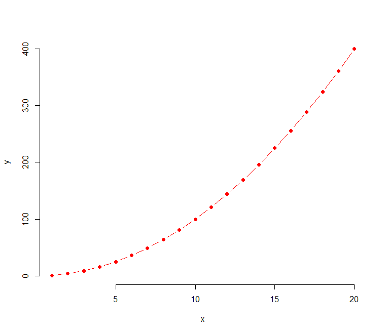
Create some variables for visualization,
Principal component analysis (PCA) in R »
x <- 1:20
y1 <- x*x
y2  <- 1*y1
Just plot a first line based on plot function in R,
plot(x, y1, type = "b", frame = FALSE, pch = 19,
     col = "red", xlab = "x", ylab = "y",
     lty = 1, lwd = 1)
Now Add a second line
lines(x, y2, pch = 18, col = "blue", type = "b",lty = 2, lwd = 1)
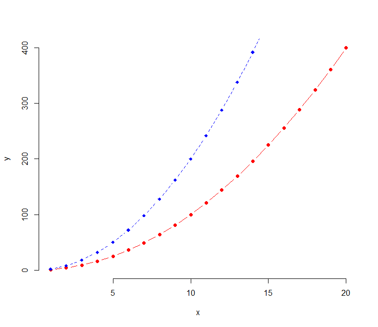
If you want you can add a legend to the plot and set legend lty
legend("topright", legend = c("Line 1", "Line 2"),
       col = c("red", "blue"), lty = 1:2, cex = 0.8)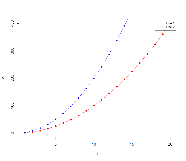
Line Types in ggplot
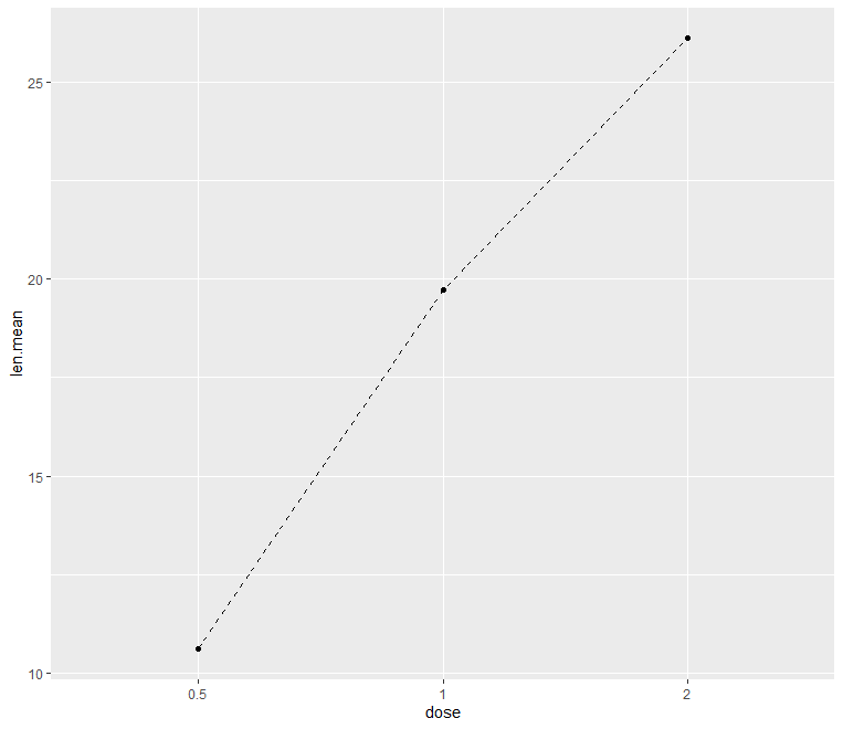
First, let’s load the data set.
Decision Trees in R » Classification & Regression »
ToothGrowth$dose <- as.factor(ToothGrowth$dose)
head(ToothGrowth)
    len supp dose
 1  4.2   VC  0.5
 2 11.5   VC  0.5
 3  7.3   VC  0.5
 4  5.8   VC  0.5
 5  6.4   VC  0.5
 6 10.0   VC  0.5
library(dplyr)
df <- ToothGrowth %>%
  group_by(dose) %>%
  summarise(len.mean = mean(len))
df
Now created average values based on group by dose.
   dose len.mean
 1  0.5   10.605
 2    1   19.735
 3    2   26.100
Let’s plot the same
library(ggplot2)
ggplot(data = df, aes(x = dose, y = len.mean, group = 1)) +
  geom_line(linetype = "dashed")+
  geom_point()
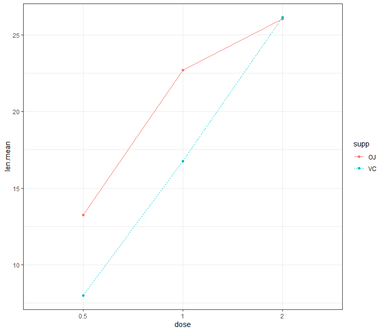
Create a line plot for multiple groups
KNN Algorithm Machine Learning » Classification & Regression »
library(dplyr)
df2 <- ToothGrowth %>%
group_by(dose, supp) %>%
summarise(len.mean = mean(len))
df2
    dose supp len.mean
 1  0.5   OJ    13.23
 2  0.5   VC     7.98
 3    1   OJ    22.70
 4    1   VC    16.77
 5    2   OJ    26.06
 6    2   VC    26.14
ggplot(df2, aes(x = dose, y = len.mean, group = supp)) +
   geom_line(aes(linetype = supp, color = supp))+
   geom_point(aes(color = supp))+theme_bw()
Now change line type and color manually
ggplot(df2, aes(x = dose, y = len.mean, group = supp)) +
   geom_line(aes(linetype = supp, color = supp))+
   geom_point(aes(color = supp))+theme_bw()+
   scale_linetype_manual(values=c("solid", "longdash"))+  scale_color_manual(values=c("#00AFBB","#FC4E07"))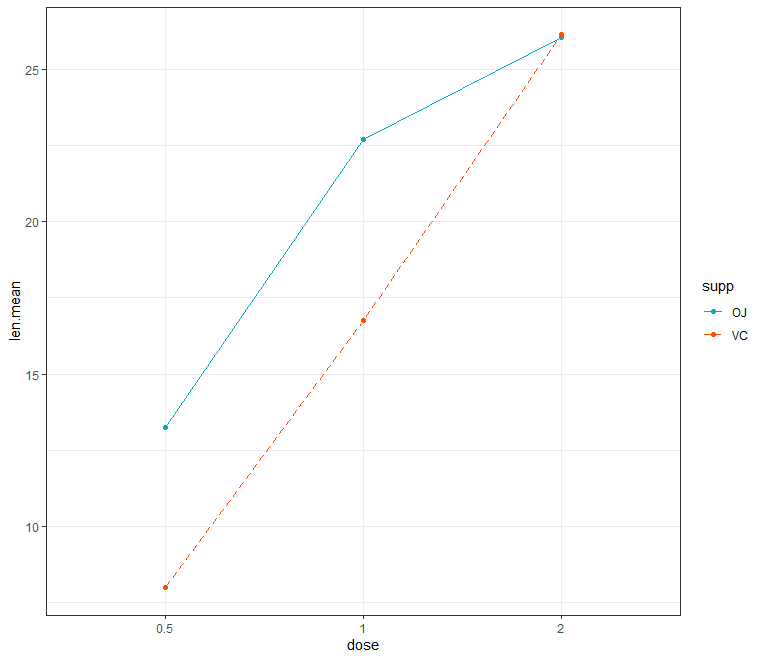
Conclusion
Use lty and lwd options, for changing lines type and thickness in R base graphics and in ggplot linetype and size are used.
Enjoyed this article? Don’t forget to show your love, Please SHARE and COMMENT below!