Self Organizing Maps in R- Supervised Vs Unsupervised
Self-organizing maps are very useful for clustering and data visualization.
Self-organizing maps (SOMs) are a form of neural network and a beautiful way to partition complex data.
In this tutorial, we are using college admission data for clustering and visualization and we are covering unsupervised and supervised maps also.
Self Organizing Maps
The main objective of the tutorial is to convert high-dimensional datasets into low-dimensional maps. In others words from many variables into the two-dimensional map.
Unsupervised Self Organizing Maps
Load Library
library(kohonen)
Getting Data
data <- read.csv("D:/RStudio/SelfOrganizingMaps/binary.csv", header = T)
str(data)
The dataset you can access from here
'data.frame': 400 obs. of  4 variables:
 $ admit: int  0 1 1 1 0 1 1 0 1 0 ...
 $ gre  : int  380 660 800 640 520 760 560 400 540 700 ...
 $ gpa  : num  3.61 3.67 4 3.19 2.93 3 2.98 3.08 3.39 3.92 ...
 $ rank : int  3 3 1 4 4 2 1 2 3 2 ...
In this dataset contain 400 observations and 4 variables. Let’s make utilize a self-organizing map for this dataset.
We need to normalize the data because the variables are different scales some variables in 100’s and other variables in 10’s let’s normalize the dataset based on scale function.
Normalization means subtracting mean from each observation and dividing with standard deviation.
X <- scale(data[,-1])
summary(X)
gre                gpa               rank
 Min.   :-3.18309   Min.   :-2.9690   Min.   :-1.5723
 1st Qu.:-0.58606   1st Qu.:-0.6829   1st Qu.:-0.5135
 Median :-0.06666   Median : 0.0134   Median :-0.5135
 Mean   : 0.00000   Mean   : 0.0000   Mean   : 0.0000
 3rd Qu.: 0.62588   3rd Qu.: 0.7360   3rd Qu.: 0.5453
 Max.   : 1.83783   Max.   : 1.6031   Max.   : 1.6041
All the variables mean values are zero now.
Self Organizing Maps (SOM)
set.seed(222)
g <- somgrid(xdim = 4, ydim = 4, topo = "rectangular" )
We are using x dimension 4 and y dimension also 4. Because we are using 4 by 4 ‘topo’ rectangular is more appropriate.
map <- som(X,
           grid = g,
           alpha = c(0.05, 0.01),
           radius = 1)
alpha is the learning weight by default vale is 0.05 to 0.01. These two numbers basically indicate amount of change.
plot(map, type='codes',palette.name = rainbow)

These provides codes plot with rainbow colors.
For example, first node indicates higher gre values compared to other variables.
map$unit.classif
[1] 11 9 7 13 16 14 5 10 12 7 1 5 7 14 7 11 1 8 7 15 12 6 16 13 4 4 15 11 14 5 11 13 12 1 5 10 5 16 10 16 3 6 6 12 14 11 6 16 16 8 9 2 13 6 12 1 12 8 10 16 6 2 9 1 9 6 13 6 15 4 9 8 2 15 13 1 12 1 5 15 13 14 3 8 11 3 6 6 4 7 7 4 7 3 6 6 13 10 14 8 8 9 2 9 7 14 4 10 8 10 13 2 8 5 1 9 10 7 4 8 15 3 16 16 1 2 15 1 10 2 6 14 6 12 3 11 2 1 6 15 7 13 9 12 2 8 10 16 5 4 4 10 7 12 9 16 3 15 6 1 6 6 6 3 6 7 2 1 11 9 11 16 9 4 2 6 3 12 12 8 9 11 7 15 16 4 9 3 3 10 14 1 9 11 6 6 12 2 9 9 13 6 7 11 15 1 4 15 12 6 13 3 3 12 6 14 5 15 5 6 12 1 5 13 14 13 6 2 10 6 2 12 10 16 4 14 6 15 16 1 3 15 14 6 5 1 6 10 9 9 13 13 15 2 13 12 10 9 10 7 14 10 12 9 11 8 2 9 6 1 7 12 7 4 10 14 11 15 13 14 7 8 13 2 10 2 4 9 13 16 6 14 7 7 3 12 5 10 6 13 6 9 10 7 8 2 5 6 10 8 9 7 9 11 2 8 8 13 11 5 8 10 2 3 16 7 6 6 6 16 1 9 5 12 11 15 12 13 5 9 2 16 11 6 12 16 6 15 10 14 7 12 12 6 15 14 6 4 9 1 15 15 14 10 5 16 16 9 15 7 15 9 14 6 15 2 6 7 12 3 7 6 6 7 3 5 7 6 6 6 14 7 12 15 11 7 12 3 7 9
Total 400 values and each value represent the node number.
For example, based on the above image, the first node value is 15 means, which needs to count from the bottom left to right, and the 15th node appearing in the top first-row second last round.
Second node value is 3 it represents the bottom first row third round and indicate more gpa values followed by gre values.
Sample size calculation formula
map$codes
gre         gpa       rank
V1   1.3594692  1.31485820  0.6945640
V2  -0.6810739 -0.23510156  1.6040909
V3  -0.6539805 -1.65455026 -0.5638446
V4   1.4587362  0.21588236 -1.3810617
V5  -0.7572771 -0.73013956 -1.5723268
V6   0.2537742  0.01067627 -0.5535859
V7   0.9863233  1.30912423 -0.8030119
V8  -1.9812946 -0.86105012  0.5525260
V9   0.2739130  0.95511660  0.6476321
V10 -1.1149956 -0.15213631 -0.5135209
V11 -1.0273085  0.83712152  0.9651872
V12 -0.1162305 -0.28408495  0.5452850
V13  1.0571487 -0.13782214  1.3377211
V14  0.9344195 -1.10529914 -0.4891997
V15 -0.1894193  1.03225963 -1.1675374
V16 -0.6891115 -1.54399882  0.9496130
Now you can see fan size depends on the above scores. For example, first fan gre is higher compared to gpa and rank
plot(map, type = "mapping")

Supervised Self Organizing Maps
We need to split the dataset into train and test datasets for the prediction and accuracy checking.
Let’s create independent samples first
set.seed(123)
ind <- sample(2, nrow(data), replace = T, prob = c(0.7, 0.3))
train <- data[ind == 1,]
test <- data[ind == 2,]
The training dataset contains 285 observations and the test has 115 observations.
Minimum number of units in experimental design
Normalization
As we don earlier need to normalize the variables.
trainX <- scale(train[,-1])
testX <- scale(test[,-1],
               center = attr(trainX, "scaled:center"),
               scale = attr(trainX, "scaled:scale"))
trainY <- factor(train[,1])
Y <- factor(test[,1])
test[,1] <- 0
testXY <- list(independent = testX, dependent = test[,1])
Classification & Prediction Model Supervised Learning
Here we are using y variable for map creation that’s is the reason we are calling this under supervised learning.
set.seed(223)
map1 <- xyf(trainX,
            classvec2classmat(factor(trainY)),
            grid = somgrid(5, 5, "hexagonal"),
            rlen = 100)
plot(map1, type='codes',palette.name = rainbow)
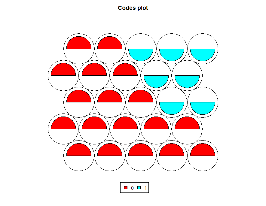
Cluster Boundaries
We can create cluster boundaries and plot both the graphs based on par mfrow.
par(mfrow = c(1,2))
plot(map1,
     type = 'codes',
     main = c("Codes X", "Codes Y"))
map1.hc <- cutree(hclust(dist(map1$codes[[2]])), 2)
add.cluster.boundaries(map1, map1.hc)
par(mfrow = c(1,1))
Prediction
pred <- predict(map1, newdata = testXY)
Now let’s see the misclassification error based on above model.
table(Predicted = pred$predictions[[2]], Actual = Y)
          Actual
Predicted  0  1
        0 65 18
        1 20 12
Conclusion
Based on the confusion matrix, total of 65+12=77 correct classifications and 38 misclassifications. So, it indicates that the model accuracy is that we get here is 65.10435.