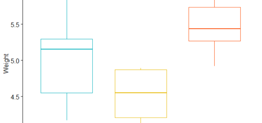
Add mean value in Boxplots in R with examples
Add mean value in Boxplots in R, To create a boxplot with a mean value in R, use the following methods:
Approach 1: Make use of R.
Let’s create boxplots with the following code
boxplot(df$values~df$group)
Then we can calculate the mean value by group
means <- tapply(df$values, df$group, mean)
Finally, add means as circles to each boxplot
points(means, pch=20)
Approach 2: Use ggplot2
library(ggplot2)
Create boxplots with mean values represented as circles.
ggplot(df, aes(x=group, y=values, fill=group)) +
  geom_boxplot() +
  stat_summary(fun=mean, geom='point', shape=20)
Add mean value in Boxplots in R
With the following data frame in R, the following examples explain how to utilize each method in practice:
Let’s create a data frame
df <- data.frame(team=rep(c('P1', 'P2', 'P3'), each=5),
                 points=c(12, 14, 5, 16, 18, 7, 16, 18, 19, 12,
                          11, 22, 23, 26, 8))
Let’s view the rows of the data frame
head(df)
  team points
1   P1     12
2   P1     14
3   P1      5
4   P1     16
5   P1     18
6   P2      7
Example 1: In Base R, make boxplots with mean values.
The following R code demonstrates how to make boxplots with mean values:
Let’s create boxplots.
How to perform the MANOVA test in R?
boxplot(df$points~df$team)

Now we can calculate the mean value by group
means <- tapply(df$points, df$team, mean)
Let’s add means as circles to each boxplot
points(means, pch=20, cex=1.5)

The median value is shown by the black lines inside each boxplot, whereas the mean value is represented by the black circles inside each boxplot.
Change the cex argument’s value to change the circle’s size.
Example 2: In ggplot2, make boxplots with mean values.
In ggplot2, the following code explains how to make boxplots with mean values.
library(ggplot2)
Now we can create boxplots with mean values.
How to Add p-values onto ggplot »
ggplot(df, aes(x=team, y=points, fill=team)) +
  geom_boxplot() +
  stat_summary(fun=mean, geom='point', shape=20, size=8) +
  theme(legend.position='none')

The median value is shown by the black lines inside each boxplot, whereas the mean value is represented by the black circles inside each boxplot.
To adjust the circle size, change the value for the size argument in the stat summary() function.


