Animated Graph GIF with gganimate & ggplot
Animated graph gif, an animated graph can effectively draw the audience’s focus and lead their eyes to specific points on the graph.
In most cases concentrating on a statistics chart is difficult and you can’t control the pace of the information being presented.
In gganimate package, it’s very easy to create animated graphs with help of ggplot.
You can also customize your graphs and make them more interactive.
This short tutorial will show you how to create animated graphs based on gganimate package. So you can add some bling to your next presentation or report.
Naive Byes classification in R
Load Library
library(gganimate)
library(ggplot2)
library(dplyr)
library(gapminder)
library(ggthemes)
library(gifski)
library(readr)
library(tidyr)
Example 1: Getting Data
str(gapminder)
The datset contains 1704 observations and 6 variables and this datset loaded from gapminder package.
tibble[,6] [1,704 x 6] (S3: tbl_df/tbl/data.frame)
 $ country  : Factor w/ 142 levels "Afghanistan",..: 1 1 1 1 1 1 1 1 1 1 ...
 $ continent: Factor w/ 5 levels "Africa","Americas",..: 3 3 3 3 3 3 3 3 3 3 ...
 $ year     : int [1:1704] 1952 1957 1962 1967 1972 1977 1982 1987 1992 1997 ...
 $ lifeExp  : num [1:1704] 28.8 30.3 32 34 36.1 ...
 $ pop      : int [1:1704] 8425333 9240934 10267083 11537966 13079460 14880372 12881816
3867957 16317921 22227415 ...
 $ gdpPercap: num [1:1704] 779 821 853 836 740 ...
Let’s create the working directory, so we can save output into a particular directory.
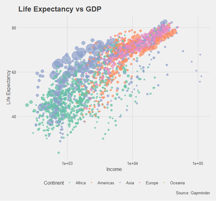
setwd("D:/RStudio/gganimate/")Let’s create basic ggplot graph and store it in graph 1.
graph1 = gapminder %>%
  ggplot(aes(x=gdpPercap, y=lifeExp, color=continent, size=pop)) +
  geom_point(alpha = 0.7, stroke = 0) +
  theme_fivethirtyeight() +
  scale_size(range=c(2,12), guide="none") +
  scale_x_log10() +
  labs(title = "Life Expectancy vs GDP",
       x = "Income",
       y = "Life Expectancy",
       color = "Continent",
       caption = "Source: Gapminder") +
  theme(axis.title = element_text(),
        text = element_text(family = "Rubik"),
        legend.text=element_text(size=10)) +
  scale_color_brewer(palette = "Set2")
Now add the animation into basic ggplot graph
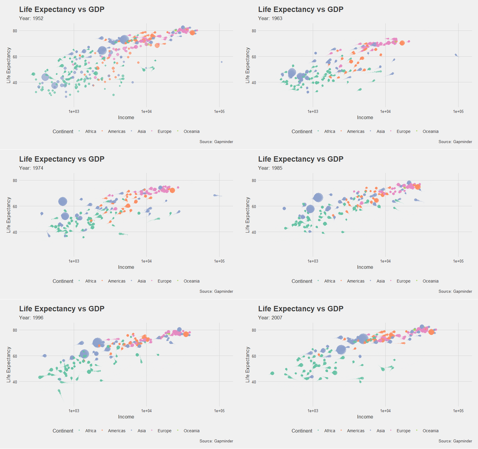
graph1.animation = graph1 +
  transition_time(year) +
  labs(subtitle = "Year: {frame_time}") +
  shadow_wake(wake_length = 0.1)
anim_save is used for saving animated graphs in the local directory. One of the common issues is saving animated graphs into the local directory, the animation goes off. anim_save function overcome this kind of issue and able to make animated graph gif.
animate(graph1.animation, height = 500, width = 800, fps = 30, duration = 10,
        end_pause = 60, res = 100)
anim_save("gapminder graph.gif")
Example 2: Getting Data
game_sales = read_csv("D:/RStudio/gganimate/vgsales.csv") %>%
  mutate(Year = as.numeric(Year)) %>%
  filter(Platform == 'PS3',
         Genre %in% c("Action", "Shooter", "Sports", "Racing", "Simulation")) %>%
  drop_na() %>%
  group_by(Year, Genre) %>%
  summarise(Sales = sum(Global_Sales, na.rm = TRUE))
Let’s print the game_sales result. This dataset you can access from kaggle
Customer segmentation analysis in R
Year Genre      Sales
   <dbl> <chr>      <dbl>
 1  2006 Action      0.92
 2  2006 Racing      7.3
 3  2006 Shooter     5.87
 4  2006 Simulation  1.08
 5  2006 Sports      2.42
 6  2007 Action     17.1
 7  2007 Racing      9.87
 8  2007 Shooter    15.7
 9  2007 Simulation  1.21
10  2007 Sports     11.5
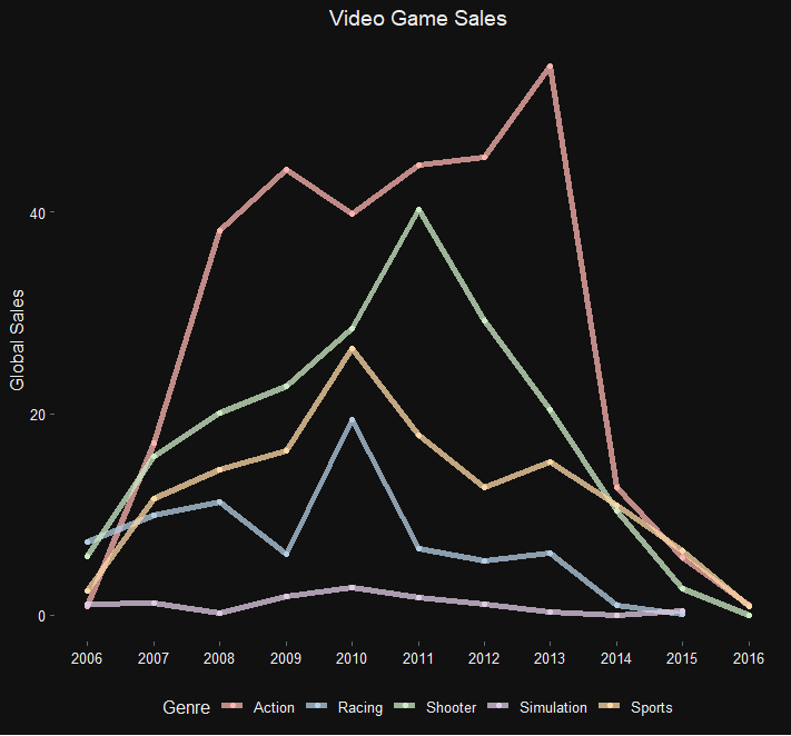
Let’s plot this result based on ggplot and store it in graph2.
graph2<- game_sales %>%
  ggplot(aes(x=Year, y=Sales, color=Genre)) +
  geom_line(size = 2, alpha = 0.75) +
  theme_solarized_2(light = FALSE) +
  labs(title = "Video Game Sales",
       y = "Global Sales") +
  theme(text = element_text(family = "DM Sans Medium", colour = "#EEEEEE"),
        title = element_text(color = "#EEEEEE"),
        axis.title.x = element_blank(),
        panel.background = element_rect(fill = NA),
        plot.background = element_rect(fill = "#111111"),
        panel.grid.major = element_blank(),
        panel.grid.minor = element_blank(),
        legend.background = element_blank(),
        legend.key = element_blank(),
        legend.position = "bottom",
        plot.title = element_text(hjust = 0.5)) +
  scale_color_brewer(palette = "Pastel1") +
  geom_point() +
  scale_x_continuous(breaks = 0:2100)
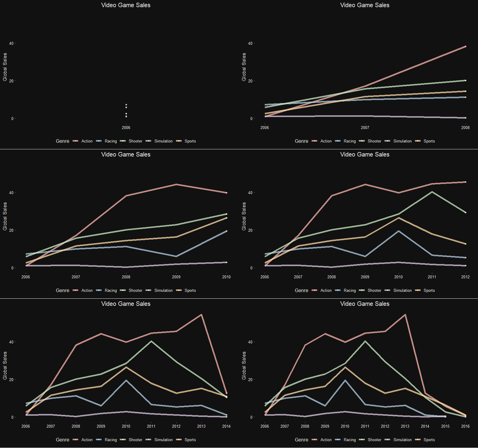
Now basic graph is ready and we can animate the same based on below code.
How to measure association strength?
graph2.animation<-graph2 +
  transition_reveal(Year) +
  view_follow(fixed_y = TRUE)
animate(graph2.animation, height = 500, width = 800, fps = 30, duration = 10,
        end_pause = 60, res = 100)
anim_save("ps3 game sales.gif")
Conclusion
Creating an animated graph in R takes just a few minutes. You don’t need to have any design or animation skills.
You can create advanced data visualizations and add animation and interactivity to them your own.
