When to Use plotly?
When to Use plotly?, as you can see, has a number of features that make it exciting and fun to use.
There are numerous situations where ggplot or plotly could be used, but the following elements might make plotly the better choice.
Missing Value Imputation in R » finnstats
- graphs displayed in an electronic or online manner.
- Users should engage with the graph.
- More customization is required than ggplot offers.
- a greater resolution should be used to render the visuals.
- working with others in different languages (e.g., Python, Bash, Node, etc.).
- constructing novel chart kinds (treemaps, sunburst, sankey, etc.).
Plotly’s biggest drawbacks are its complexity and inadequate documentation. Although it is a very potent library, it is intended for a very technical audience.
Although their documentation has significantly improved over the past year, it can still be challenging for novice users to understand and locate the information they require (as of the writing of this article).
Plotly Features
Plotly offers a wide range of sophisticated functions. You’ve already come across a handful of them!
The most prevalent traits are:
- Information that appears when you hover over a tooltip.
- Graphs can be zoomed in or out.
- Graphs can be exported as images by users.
Best Data Science Books For Beginners » finnstats
Some of the more difficult ones include:
- combining various graphs together.
- details on template hover.
- animated visuals and animations.
- the incorporation of commercial coding environments.
Plotly has a tonne more features than that!
How to combine Multiple Plots in R » finnstats
You’ll be happy to know about the ggplotly function, which takes an existing ggplot graph and renders it using the plotly library, if you’re already familiar with ggplot.
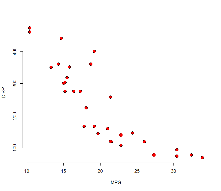
Here is an illustration utilizing the same data that we previously graphed.
The ggplot2 package must be installed before running the following R code, so keep that in mind:
df <- mtcars
df$name <- row.names(mtcars)
P1 <- ggplot2::ggplot(data = df, aes(x=cyl, y=disp)) + geom_point(aes(color = factor(cyl)))
ggplotly(P1)

Free Best Online Course For Statistics – Data Science Tutorials