Transition plot in R-change in time visualization
Transition Plot in R, when we have quantitative data for change in time, visualization is straight forward but in the case of a categorical variable, it’s not as easy.
In this article, we are going to describe transition plots for categorical variables.
Funnel Chart in R-Interactive Funnel Plot »
Approach 1:-
You can use plotmat function from the diagram package.
If you are not installed, let’s install the package.
install.packages("diagram")
library(diagram)
plotmat(transition_matrix[1:3,1:3])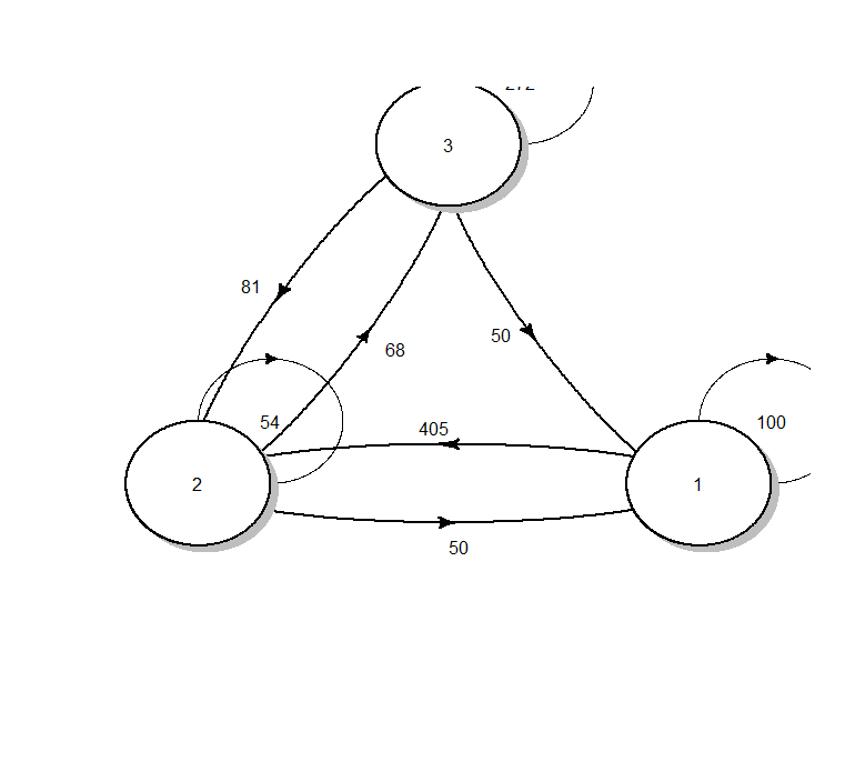
Bubble Chart in R-ggplot & Plotly » (Code & Tutorial) »
Approach 2:-
Let’s load the package transition plot function from Gmisc package.
library(Gmisc)
library(grid)
Let’s create a matrix for visualization,
no_boxes <- 3
transition_matrix <- matrix(NA, nrow = no_boxes, ncol = no_boxes)
transition_matrix[1, ] <- 200 * c(.5, .25, .25)
transition_matrix[2, ] <- 540 * c(.75, .10, .15)
transition_matrix[3, ] <- 340 * c(0, .2, .80)
transition_matrix
     [,1] [,2] [,3]
[1,]  100   50   50
[2,]  405   54   81
[3,]    0   68  272
Let’s load the transition plot function and fill the box names
Visualization Graphs-ggside with ggplot »
Transition plot in R
transitionPlot(transition_matrix,
               box_txt = c("First", "Second", "Third"),
               type_of_arrow = "simple",
               min_lwd = unit(1, "mm"),
               max_lwd = unit(6, "mm"),
               overlap_add_width = unit(1, "mm"))
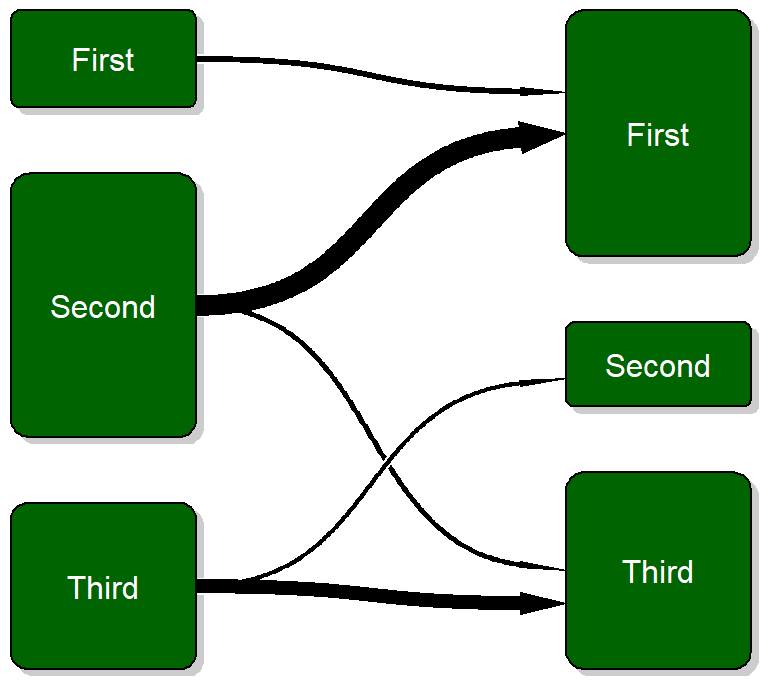
Based on a transition plot function, visualizing time change is quick and provide more intuitive understanding. The lines indicates the transition from one particular group/level into the next.
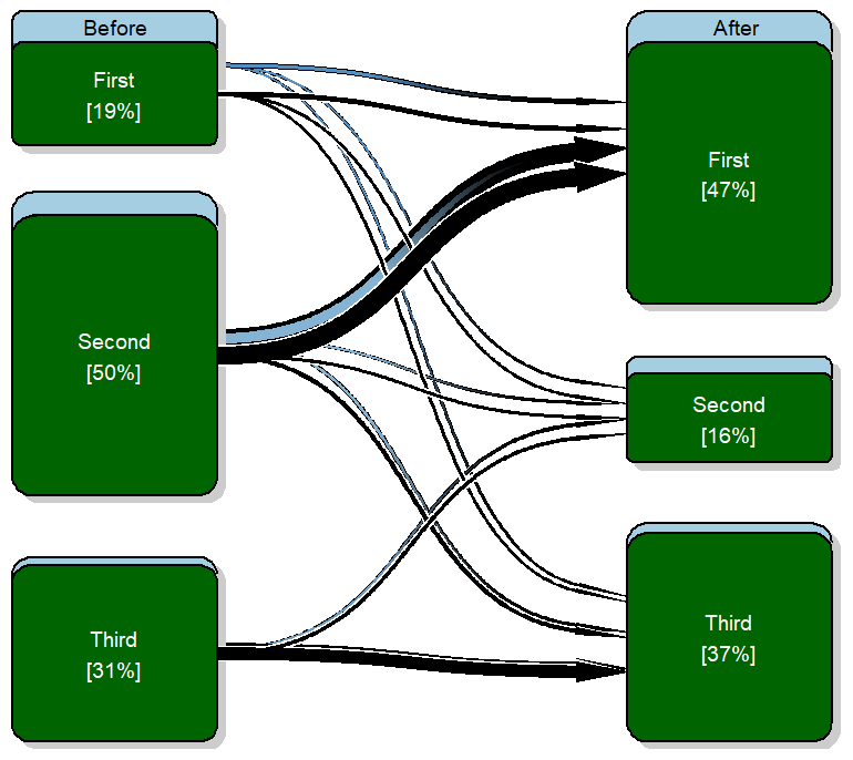
library(RColorBrewer)
output_perc <-
  function(txt, n) sprintf("%s\n[%.0f%%]", txt, n)
box_txt <-
  cbind(mapply(output_perc,
               txt = c("First", "Second", "Third"),
               n = prop.table(rowSums(transition_matrix))*100),
        mapply(output_perc,
               txt = c("First", "Second", "Third"),
               n = prop.table(colSums(transition_matrix))*100))
transitionPlot(transition_matrix,
box_label = c("Before", "After"),
box_txt = box_txt,
cex = 1.2,
type_of_arrow = "simple") You can add title while using main, box labels based on box_label, and customizing box text can using box_txt. The box_txt vector assumes the same text or label for both left and right boxes.
Conclusion
The function transition plot is from Gmisc-package and it’s very handy when we need categorical time change visualization. The original idea was for transitionPlot is to show the before and after impact.