Bubble Chart in R-ggplot & Plotly
Bubble Chart in R, A bubble chart is majorly used to show the relationships between numeric variables and it can visualize two to four dimensions.
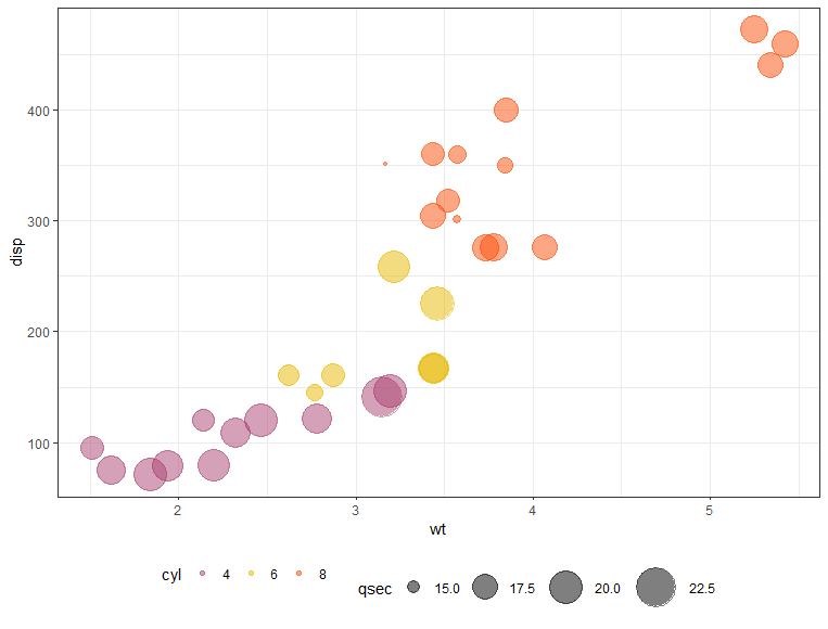
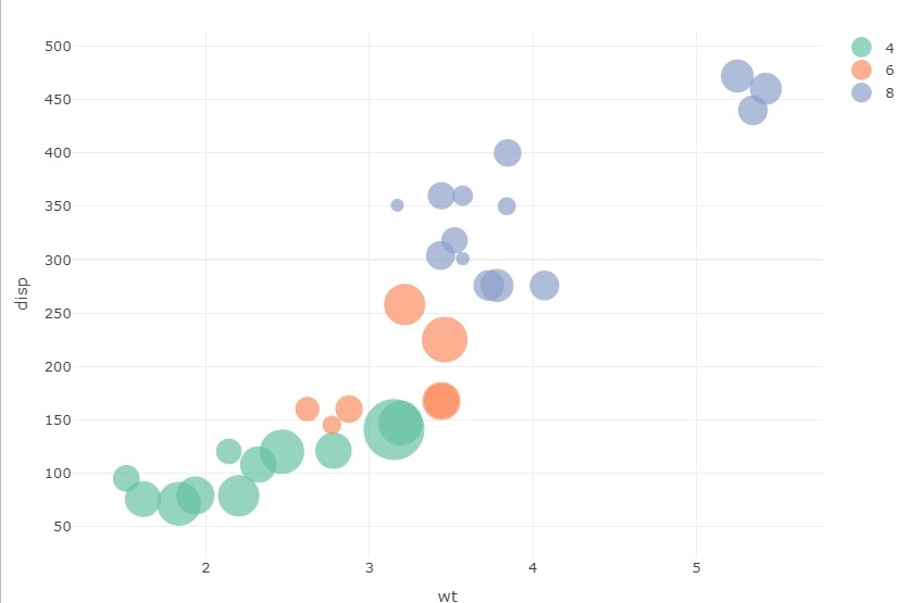
The first two dimensions are for coordinates, the third dimension is for color, and the fourth as size.
The bubble chart is an enhancement of the normal scatter plot instead of traditional dots or points in the scatter plot are replaced by circles or bubbles.
This article will describe how to create a bubble chart based on ggplot2 and plotly.
Bubble Chart in R
First, load ggplot2 package in R
Method 1:-
Ggplot2 allows rendering almost all types of charts and graphs. In this article approach is like loading the library, create a data frame, and display a plot.
library(ggplot2)
Load the data from mtcars
data("mtcars")
df <- mtcars
Let’s convert cyl as a grouping variable
QQ-plots in R: Quantile-Quantile Plots-Quick Start Guide »
df$cyl <- as.factor(df$cyl)
Let’s see the data frame
head(df[, c("wt", "disp", "cyl", "qsec")])wt disp cyl qsec Mazda RX4 2.620 160 6 16.46 Mazda RX4 Wag 2.875 160 6 17.02 Datsun 710 2.320 108 4 18.61 Hornet 4 Drive 3.215 258 6 19.44 Hornet Sportabout 3.440 360 8 17.02 Valiant 3.460 225 6 20.22
Points size is controlled by a continuous variable, in this case, qsec. argument alpha is used to control color transparency and should lie between 0 and 1.
ggplot(df, aes(x = wt, y = disp)) +
  geom_point(aes(color = cyl, size = qsec), alpha = 0.5) +
  scale_color_manual(values = c("#AA4371", "#E7B800", "#FC4E07")) +
  scale_size(range = c(1, 13)) + # Adjust the range of points size
  theme_set(theme_bw() +theme(legend.position = "bottom"))
Correlation Analysis Different Types of Plots in R »
Method 2:-
library(plotly)
bubbleplot <- plot_ly(df, x = ~wt, y = ~disp,
                      text = ~cyl, size = ~qsec,
                      color = ~cyl, sizes = c(10, 50),
                      marker =
                        list(opacity = 0.7,
                             sizemode = "diameter"))
bubbleplot <- bubbleplot%>%layout
bubbleplot

Don’t forget to show your love, Subscribe the Newsletter and COMMENT below!
[newsletter_form type="minimal"]


