Error Bar Plot in R-Adding Error Bars-Quick Guide
Error bar Plot, Error bars are visual representations of the variability of data and used on graphs to suggest the error in a reported measurement.
They give a general idea of how precise a measurement is, or conversely, how far from the reported value the true value might be.
Error bars regularly constitute one standard deviation uncertainty, one standard error, or a 95% confidence interval.
Error bar mainly communicates how the data spread around the mean, for example, a small sd bar indicates lower spread, and a higher sd indicates higher spread. In other words, a smaller sd indicates more reliability and a higher sd indicates less reliability.
The standard deviation error bars on a chart can be used to get an idea for significant differences exists or not.
When standard deviation error bars overlap quite a bit, it provides a hint that the difference is not statistically significant.
Animated Graph GIF with gganimate & ggplot »
When standard deviation error bars overlap even less, it provides the hint that the difference is probably not statistically significant.
When standard deviation error bars do not overlap, it provides the hint that the difference may be significant, but cannot be sure.
Before making the decision based on an error bar chart, one need to perform a statistical test to draw a conclusion.
Standard deviation is the measure of the variability, for testing the significant difference sample size also needs to account.
Recommended, need to perform an appropriate statistical test to draw a conclusion about significant differences.
Here we are going to discuss how to create error bar plots with help of ggplot.
Visualization Graphs-ggside with ggplot »
Following function will help us to summarize the dataset.
data_summary <- function(data, varname, groupnames){
require(plyr)
summary_func <- function(x, col){
c(mean = mean(x[[col]], na.rm=TRUE),
sd = sd(x[[col]], na.rm=TRUE))
}
data_sum<-ddply(data, groupnames, .fun=summary_func,
varname)
data_sum <- rename(data_sum, c("mean" = varname))
return(data_sum)
}
df2 <- data_summary(ToothGrowth, varname="len",
groupnames=c("supp", "dose"))
df2$dose=as.factor(df2$dose)
head(df2)
    supp dose len       sd
 1   OJ  0.5 13.23 4.459709
 2   OJ    1 22.70 3.910953
 3   OJ    2 26.06 2.655058
 4   VC  0.5  7.98 2.746634
 5   VC    1 16.77 2.515309
 6   VC    2 26.14 4.797731
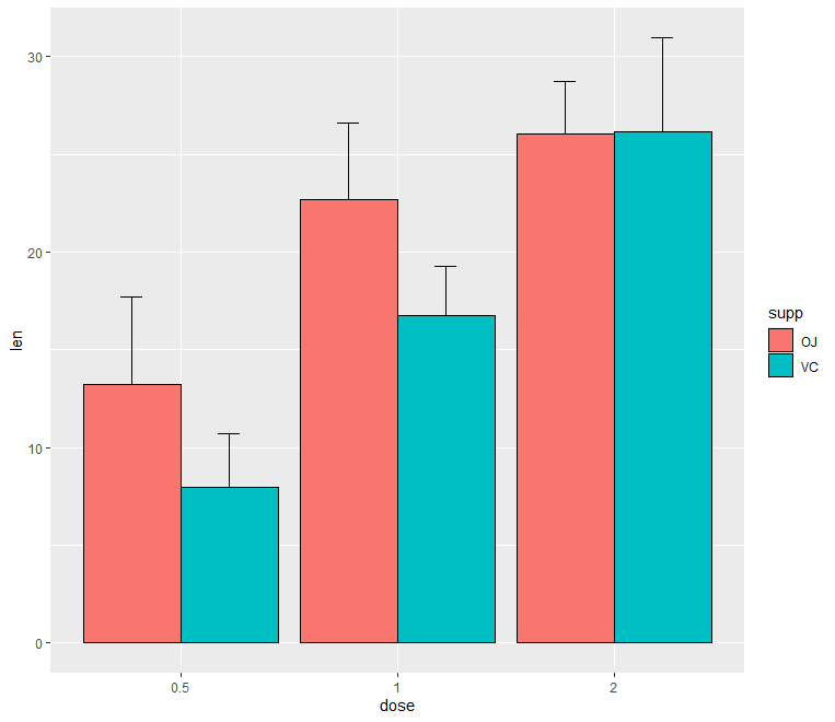
Error Bar Plot
library(ggplot2)
 p<- ggplot(df2, aes(x=dose, y=len, fill=supp)) +
   geom_bar(stat="identity", color="black",
            position=position_dodge()) +
   geom_errorbar(aes(ymin=len-sd, ymax=len+sd), width=.2,
                 position=position_dodge(.9))
 print(p)
You can create plot based on only upper error bars
summarize in r, Data Summarization In R »
ggplot(df2, aes(x=dose, y=len, fill=supp)) +
geom_bar(stat="identity", color="black", position=position_dodge()) +
geom_errorbar(aes(ymin=len, ymax=len+sd), width=.2,
position=position_dodge(.9))
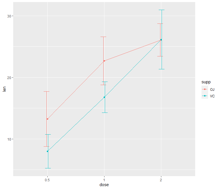
Line Error Bar Plot
p<- ggplot(df2, aes(x=dose, y=len, group=supp, color=supp)) +
geom_line() +
geom_point()+
geom_errorbar(aes(ymin=len-sd, ymax=len+sd), width=.2,
position=position_dodge(0.05))
print(p)
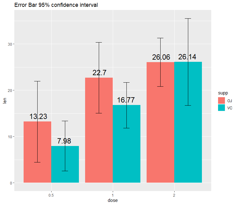
Error Bar Plot with CI
ggplot(df2, aes(x = dose, y = len, fill = supp)) +
geom_bar(stat = "identity", position = "dodge") +
ggtitle("Error Bar 95% confidence interval") + ylab("len") +
geom_errorbar(aes(ymin = len - 1.96 * sd, ymax = len + 1.96 * sd), width = 0.2, position = position_dodge(0.9)) +
geom_text(aes(label = round(len, 2)), size = 6,
position = position_dodge(0.85), vjust = -0.5)
Multiple R functions available to calculate sd, se and mean, so you can make utilize the same.
Based on aggregate function also can summarize the data set easily.
mydata<-ToothGrowth
stderr <- function(x) sqrt(var(x)/length(x))
datatoplotse<-aggregate(mydata$len, list(mydata$supp, mydata$dose), stderr)
datatoplotsd<-aggregate(mydata$len, list(mydata$supp, mydata$dose), sd,na.rm=TRUE)
datatoplot<-aggregate(mydata$len, list(mydata$supp, mydata$dose), mean,na.rm=TRUE)
Conclusion
In this tutorial, decscribes how to add error bars while using ggplot package.


A number of journals now do not accept these “dynamite plots” (also called “plunger plots”, “toiletbrush plots”, or “bogbrush plots”) as they are often severe distortions of the actual data distributions. When samples are small, kindly consider using dotplots; when samples are larger consider boxplots or violin plots with or without dotplot overlays.
Thanks for the valuable information.
Great tutorial. Very useful code and examples!
However in the last graph for error bars, when they show the Standard Error of the Mean you should have devided the standard deviation by the square root of the sample size first.
I think then the error bars for 0.5 and 1.0 dose would look significantly different from one another.
Thanks for the comment, Yes Standard error will provide a more clear picture, for significance testing appropriate statistical tests will be more ideal…