Correlation Analysis Different Types of Plots in R
Correlation analysis, correlation is a term that is a measure of the strength of a relationship between two variables.
Pearson’s Product-Moment Correlation
One of the most common measures of correlation is Pearson’s product-moment correlation, which is commonly referred to simply as the correlation, or just the letter r.
Correlation shows the strength of a relationship between two variables and is expressed numerically by the correlation coefficient.
Naïve Bayes Classification in R
Correlation Analysis
The correlation coefficient r measures the strength and direction of a linear relationship,
- 1 indicates a perfect positive correlation.
- -1 indicates a perfect negative correlation.
- 0 indicates that there is no relationship between the different variables.
Values between -1 and 1 denote the strength of the correlation, as shown in the example below.
In this tutorial, we will explain the different ways of executing correlation plots in R
Cormorant Package
# remotes::install_github(“r-link/corrmorant”)
library(corrmorant)
library(tidyverse)
library(dplyr)
We are selecting only quantitative variables for further analysis
mpg<-select(mpg,displ,cyl,cty, hwy)
corrmorant(mpg, style = "binned") +
  theme_dark() +
  labs(title = "Correlations")
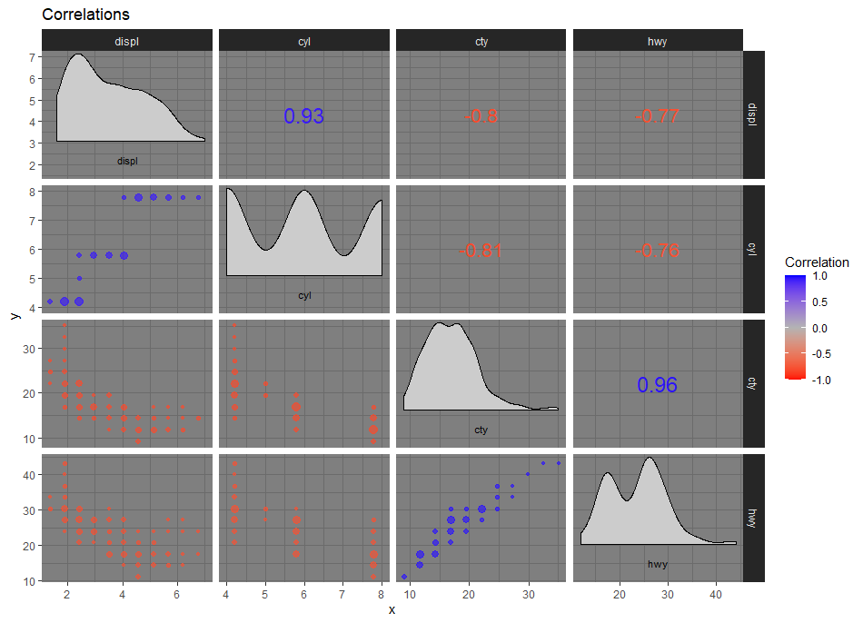
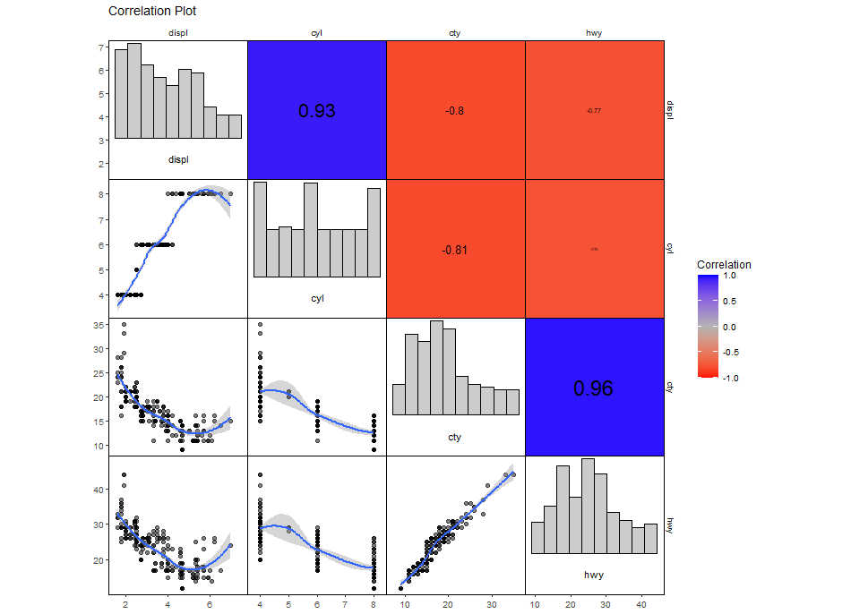
Customized Plot from ggcorrm
ggcorrm(data = mpg) +
  lotri(geom_point(alpha = 0.5)) +
  lotri(geom_smooth()) +
  utri_heatmap() +
  utri_corrtext() +
  dia_names(y_pos = 0.15, size = 3) +
  dia_histogram(lower = 0.3, fill = "grey80", color = 1) +
  scale_fill_corr() +
  labs(title = "Correlation Plot")
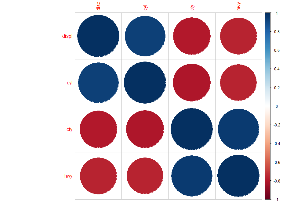
Visualize correlation matrix using corrplot
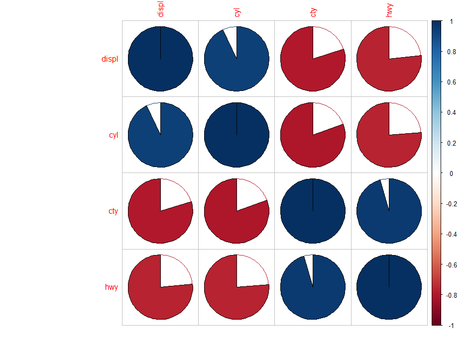
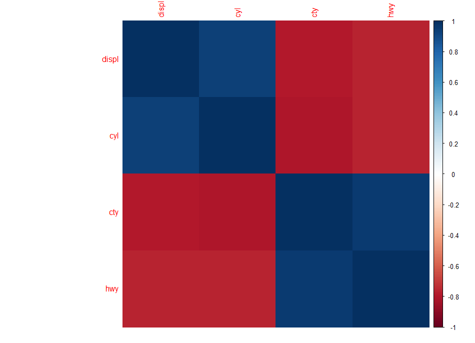
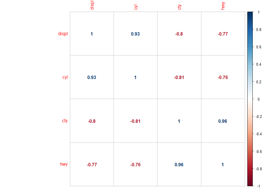
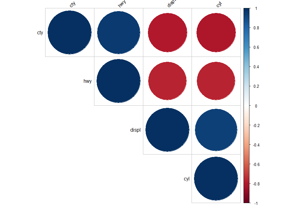
Following plots, correlation coefficients are colored according to the value. The correlation matrix can be also reordered according to the degree of association between variables.
library(corrplot)
library(RColorBrewer)
M <-cor(mpg)
corrplot(M, method="circle")
corrplot(M, method="pie")
Difference between association and correlation
corrplot(M, method="color")
corrplot(M, method="number")
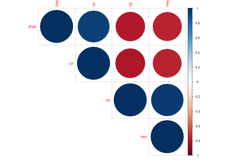
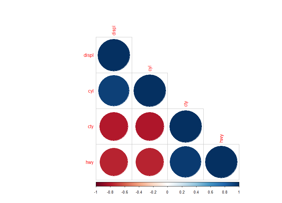
There are three types of layout :
- “full” (default) : display full correlation matrix
- “upper”: display upper triangular of the correlation matrix
- “lower”: display lower triangular of the correlation matrix
corrplot(M, type="upper")
corrplot(M, type="lower")
Types of data visualization charts
corrplot(M, type="upper", order="hclust")
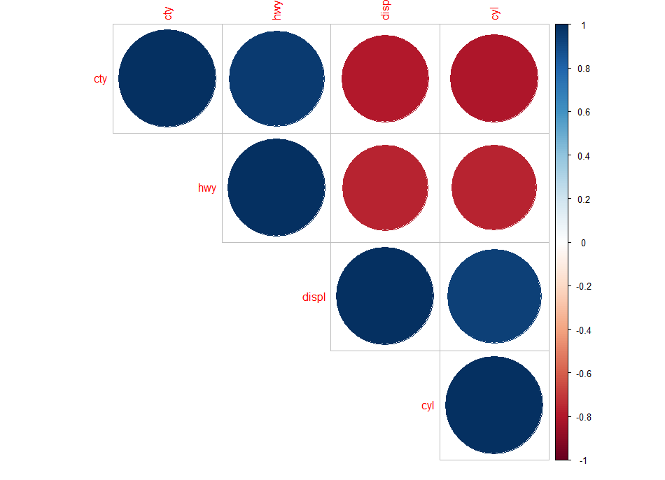
Using different color spectrum
col<- colorRampPalette(c("red", "white", "blue"))(20)
corrplot(M, type="upper", order="hclust", col=col)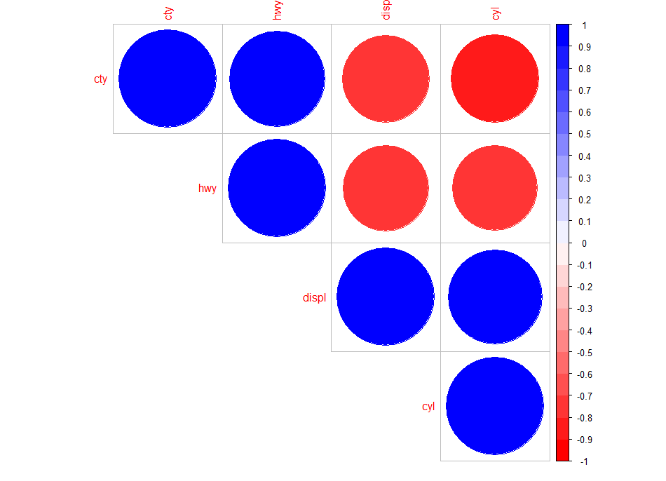
Change background color to lightblue
corrplot(M, type="upper", order="hclust", col=c("black", "white"),
         bg="lightblue")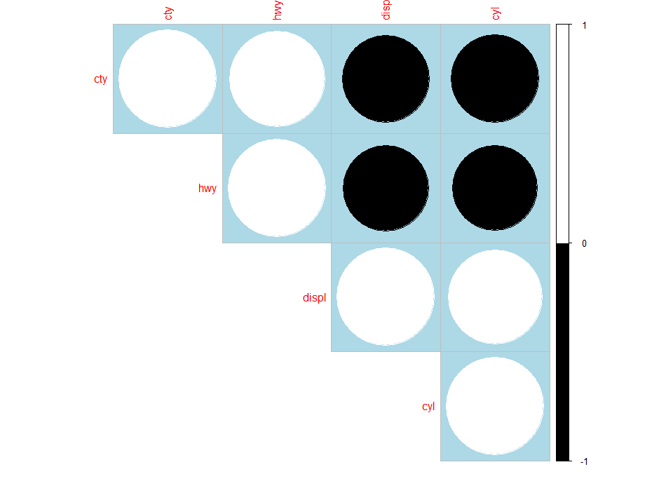
Changing the color of the plot
Random Forest Feature selection in R
corrplot(M, type="upper", order="hclust",
         col=brewer.pal(n=8, name="PuOr"))
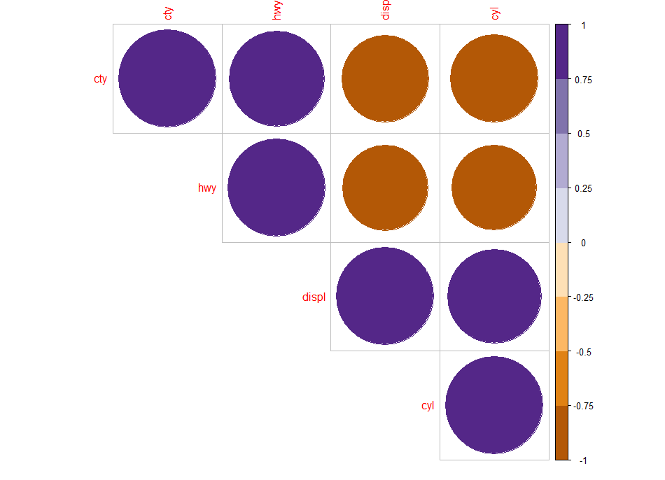
Changing the color and the rotation of text labels
corrplot(M, type="upper", order="hclust", tl.col="black", tl.srt=45)
Customize the corrplot
col <- colorRampPalette(c("#BB4444", "#EE9988", "#FFFFFF", "#77AADD", "#4477AA"))
Specialized the insignificant value according to the significant level
corrplot(M, type="upper", order="hclust",
         p.mat = p.mat, sig.level = 0.01)
corrplot(M, method="color", col=col(200),
         type="upper", order="hclust",
         addCoef.col = "black", # Add coefficient of correlation
         tl.col="black", tl.srt=45, #Text label color and rotation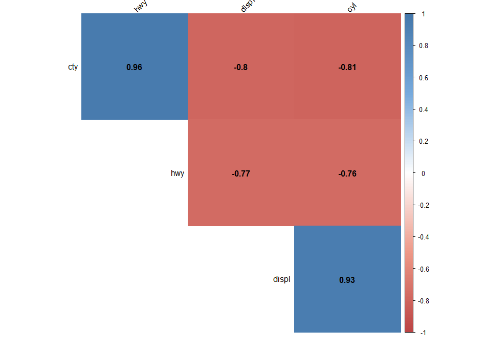
sjPlot Package
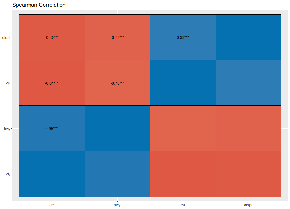
sjp.corr( data, title = NULL, axis.labels = NULL, sort.corr = TRUE, decimals = 3, na.deletion = c("listwise", "pairwise"), corr.method = c("pearson", "spearman", "kendall"), geom.colors = "RdBu", wrap.title = 50, wrap.labels = 20,sjp.corr 65 show.legend = FALSE, legend.title = NULL, show.values = TRUE, show.p = TRUE, p.numeric = FALSE )sjplot is very useful for small number of variables.
library(sjPlot)
sjp.corr(mpg,title ="Spearman Correlation",decimals =2)
PerformanceAnalytics Package
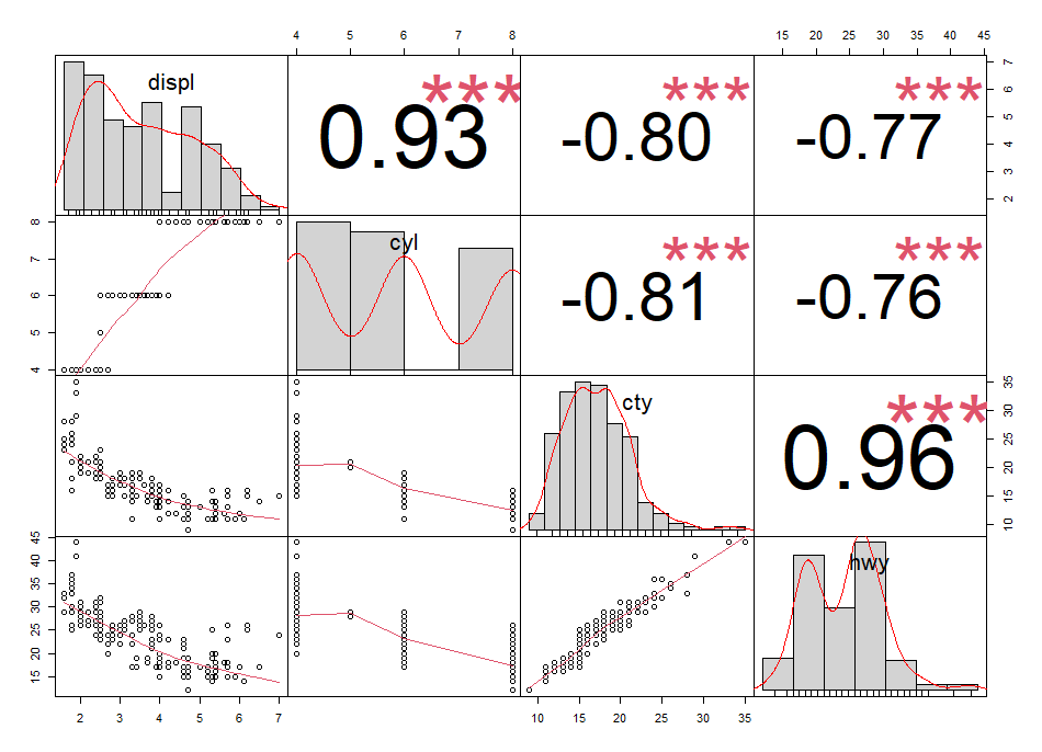
library(PerformanceAnalytics)
chart.Correlation(mpg, histogram=TRUE, pch="+")
ggcorrplot Package
library(ggcorrplot)
r <- cor(mpg, use="complete.obs")
ggcorrplot(r,
hc.order = TRUE,
type = "lower",
lab = TRUE)
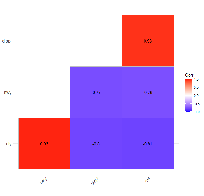
Correlation plots are the best way to show the pattern and relationship.
If you have utilized some other correlation plot please mention in the comment box will include the same.


Dendograms could also be useful if you have many variables despite that you lose some information
Sure…Thanks for your reply