How to Rotate Axis Labels in ggplot2?
When creating data visualizations in ggplot2, axis labels can sometimes overlap or become difficult to read, especially when dealing with long category names or a large number of values. Rotating axis labels is a simple yet effective way to improve the readability and appearance of your charts.
In this tutorial, you’ll learn how to rotate axis labels in ggplot2, adjust their alignment, and apply best practices for creating professional-looking visualizations in R.
Why Rotate Axis Labels?
Rotating axis labels is useful when:
- Category names are long.
- There are many categories on the axis.
- Labels overlap and become unreadable.
- You want to improve the presentation quality of reports and dashboards.
The theme() function in ggplot2 allows you to customize axis text using the element_text() function.
Create Sample Data
Let’s start by creating a simple dataset.
library(ggplot2)

df <- data.frame(
  Product = c(
    "Artificial Intelligence",
    "Machine Learning",
    "Data Science",
    "Business Intelligence",
    "Cloud Computing"
  ),
  Sales = c(120, 150, 180, 110, 140)
)

df
Create a Basic Bar Chart
ggplot(df, aes(x = Product, y = Sales)) +
  geom_col(fill = "steelblue")
With longer category names, you’ll notice that the x-axis labels may overlap.
Rotate X-Axis Labels by 45 Degrees
One of the most common solutions is rotating labels by 45 degrees.
ggplot(df, aes(x = Product, y = Sales)) +
  geom_col(fill = "steelblue") +
  theme(
    axis.text.x = element_text(
      angle = 45,
      hjust = 1
    )
  )
Explanation
angle = 45rotates labels 45 degrees.hjust = 1aligns labels properly after rotation.
This approach works well for moderately long labels.
Rotate X-Axis Labels by 90 Degrees
For very long category names, a vertical orientation is often best.
ggplot(df, aes(x = Product, y = Sales)) +
  geom_col(fill = "steelblue") +
  theme(
    axis.text.x = element_text(
      angle = 90,
      vjust = 0.5,
      hjust = 1
    )
  )
Benefits
- Prevents label overlap.
- Maximizes space usage.
- Ideal for large categorical datasets.
Rotate Y-Axis Labels
You can also rotate labels on the y-axis.
ggplot(df, aes(x = Product, y = Sales)) +
  geom_col(fill = "steelblue") +
  theme(
    axis.text.y = element_text(
      angle = 45
    )
  )
This is less common but useful in specialized visualizations.
Customize Font Size and Style
Rotated labels can be further customized.
ggplot(df, aes(x = Product, y = Sales)) +
  geom_col(fill = "steelblue") +
  theme(
    axis.text.x = element_text(
      angle = 45,
      hjust = 1,
      size = 12,
      face = "bold",
      color = "darkblue"
    )
  )
Options include:
size– text sizeface– normal, bold, italiccolor– text colorfamily– font family
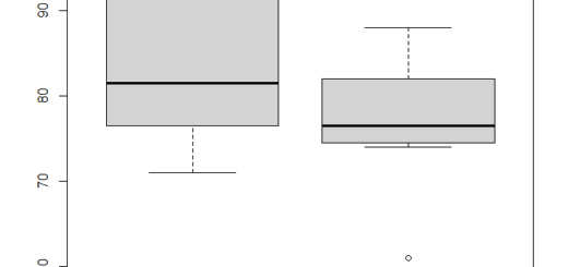
Rotate Labels in Boxplots
Axis label rotation works with all ggplot2 chart types.
ggplot(iris, aes(x = Species, y = Sepal.Length)) +
  geom_boxplot(fill = "lightgreen") +
  theme(
    axis.text.x = element_text(
      angle = 45,
      hjust = 1
    )
  )
Rotate Labels in Faceted Charts
For faceted visualizations:
ggplot(mtcars,
       aes(x = factor(cyl),
           y = mpg)) +
  geom_boxplot() +
  facet_wrap(~gear) +
  theme(
    axis.text.x = element_text(
      angle = 45,
      hjust = 1
    )
  )
The rotated labels improve readability across all panels.
Alternative: Flip the Coordinates
Instead of rotating labels, you can flip the chart.
ggplot(df, aes(x = Product, y = Sales)) +
  geom_col(fill = "steelblue") +
  coord_flip()
This converts the chart into a horizontal bar chart, often making long labels easier to read.
Best Practices
Use 45 Degrees for Moderate Label Lengths
angle = 45
Provides a good balance between readability and space usage.
Use 90 Degrees for Very Long Labels
angle = 90
Ideal for crowded charts.
Adjust Alignment
Always combine rotation with:
hjust = 1
or
vjust = 1
to prevent labels from appearing misaligned.
Consider Horizontal Charts
For extremely long category names, coord_flip() often produces cleaner visualizations than rotated text.
Complete Example
library(ggplot2)

df <- data.frame(
  Product = c(
    "Artificial Intelligence",
    "Machine Learning",
    "Data Science",
    "Business Intelligence",
    "Cloud Computing"
  ),
  Sales = c(120, 150, 180, 110, 140)
)

ggplot(df, aes(x = Product, y = Sales)) +
  geom_col(fill = "steelblue") +
  labs(
    title = "Sales by Technology Category",
    x = "Technology",
    y = "Sales"
  ) +
  theme_minimal() +
  theme(
    axis.text.x = element_text(
      angle = 45,
      hjust = 1,
      size = 11
    )
  )
Conclusion
Rotating axis labels in ggplot2 is a simple but powerful technique for improving chart readability. By using element_text() within theme(), you can rotate labels by 45 or 90 degrees, adjust alignment, and customize their appearance.
The most commonly used syntax is:
theme(
  axis.text.x = element_text(
    angle = 45,
    hjust = 1
  )
)
Whether you’re creating dashboards, business reports, statistical analyses, or data science visualizations, properly formatted axis labels help make your charts more professional and easier to interpret.